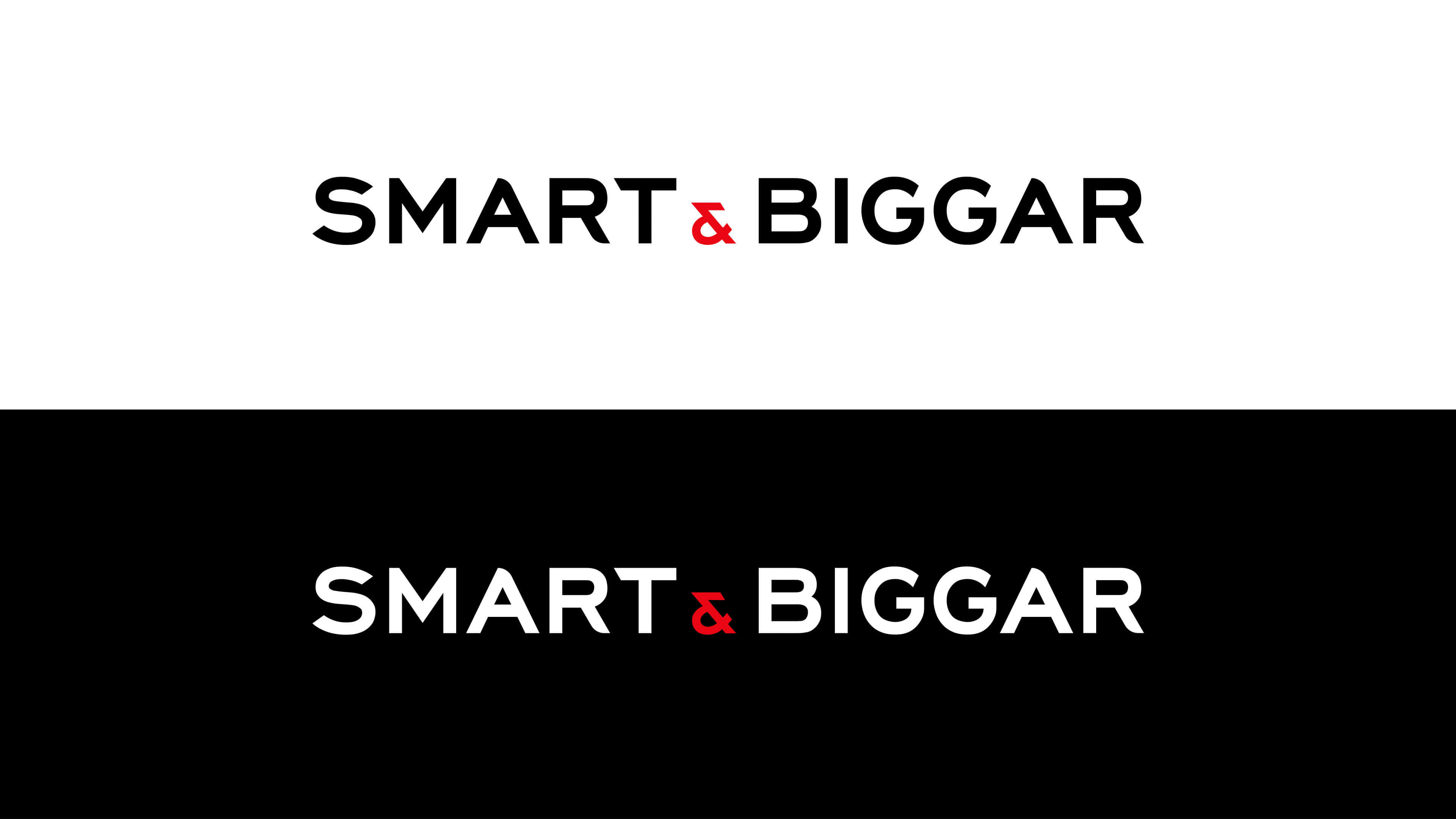
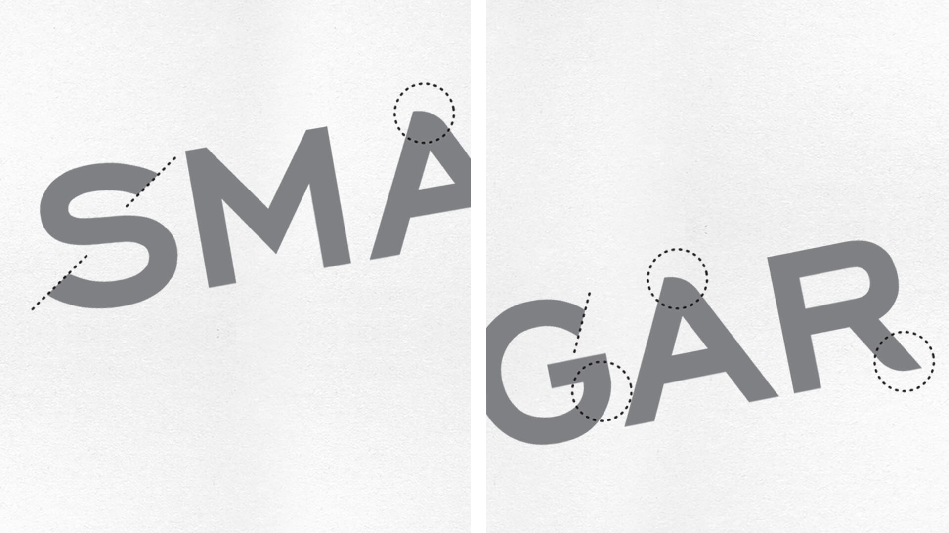
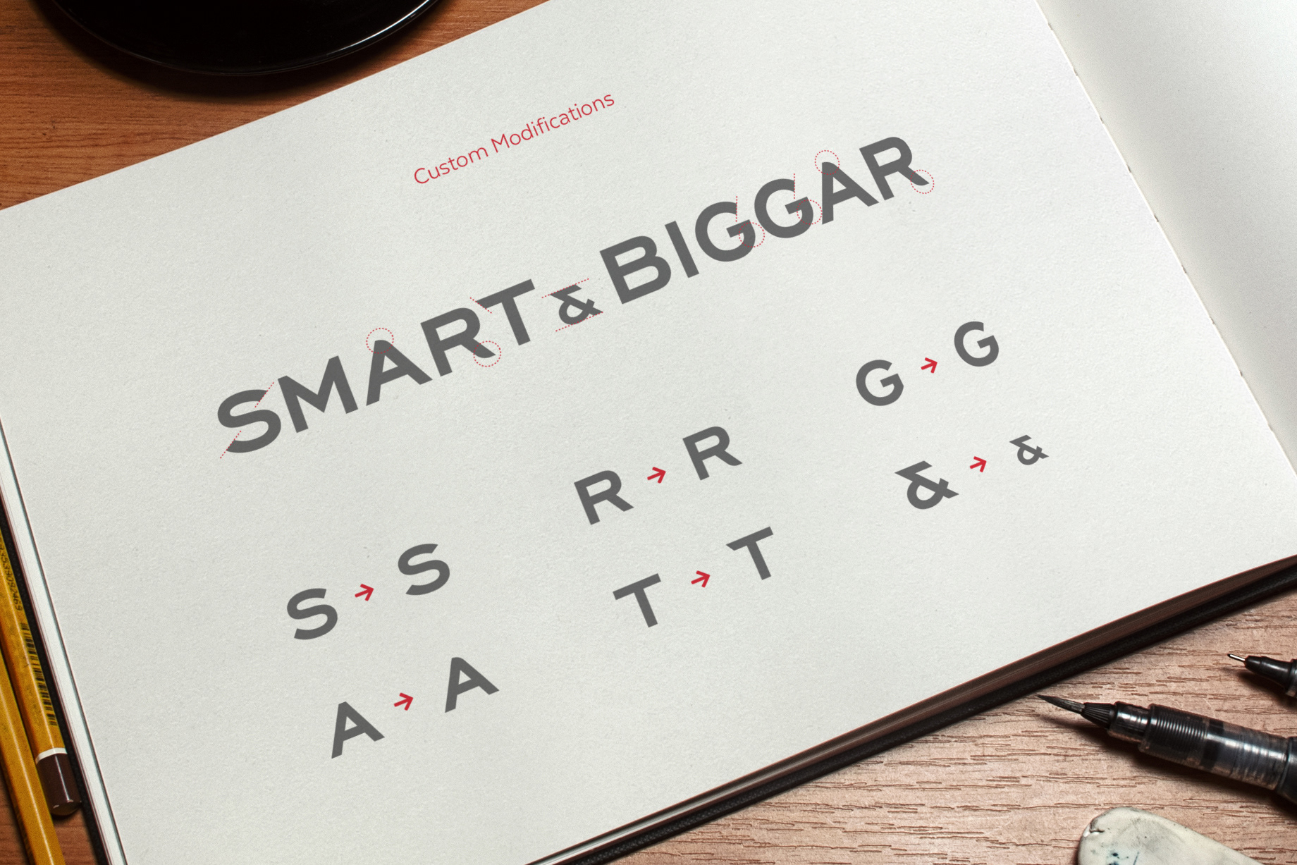

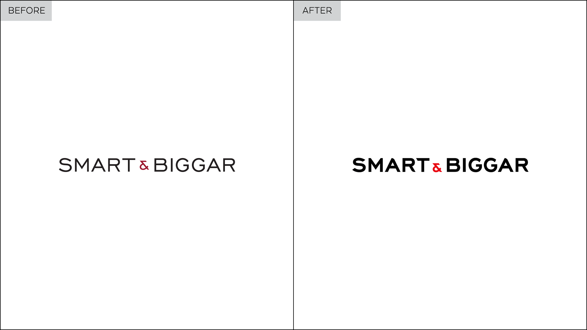
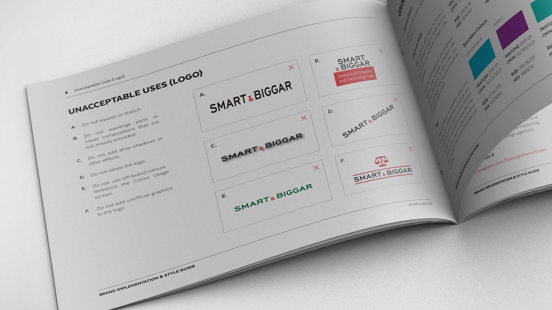
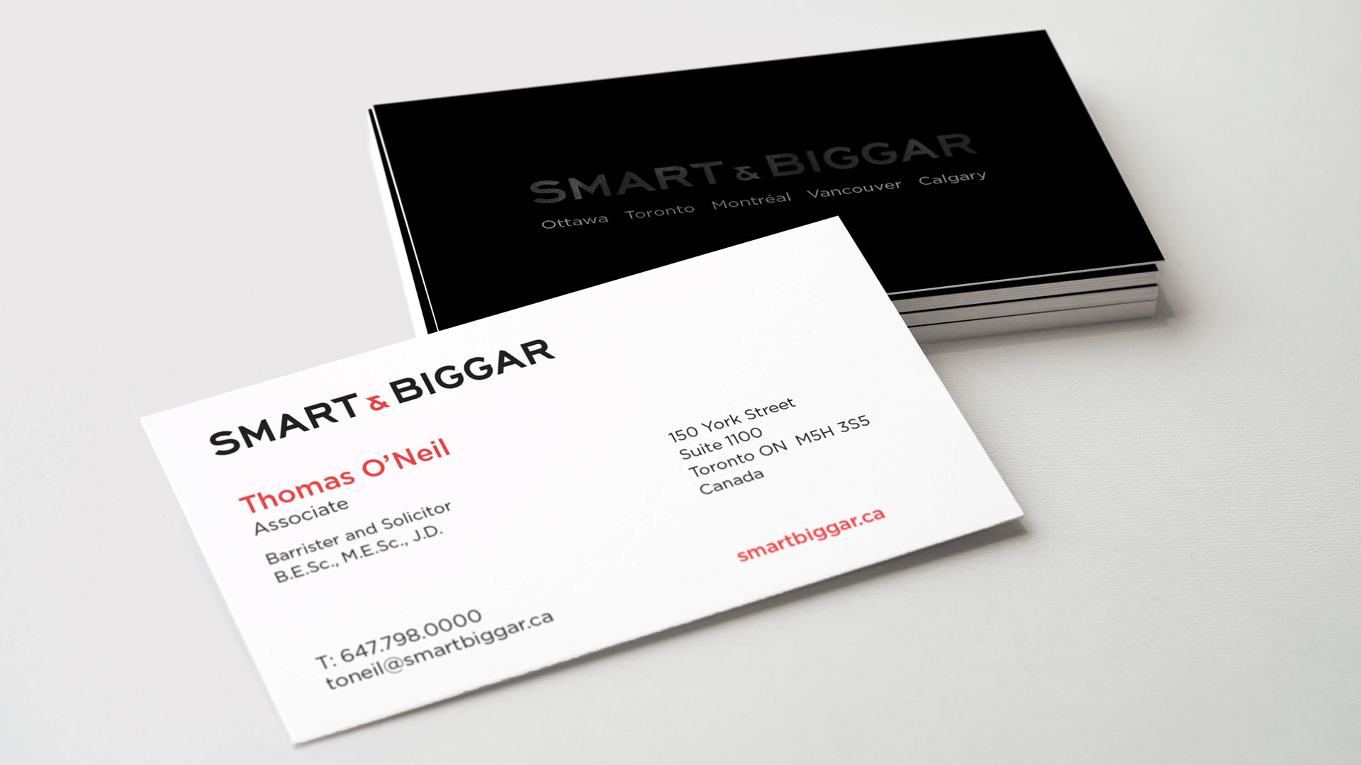
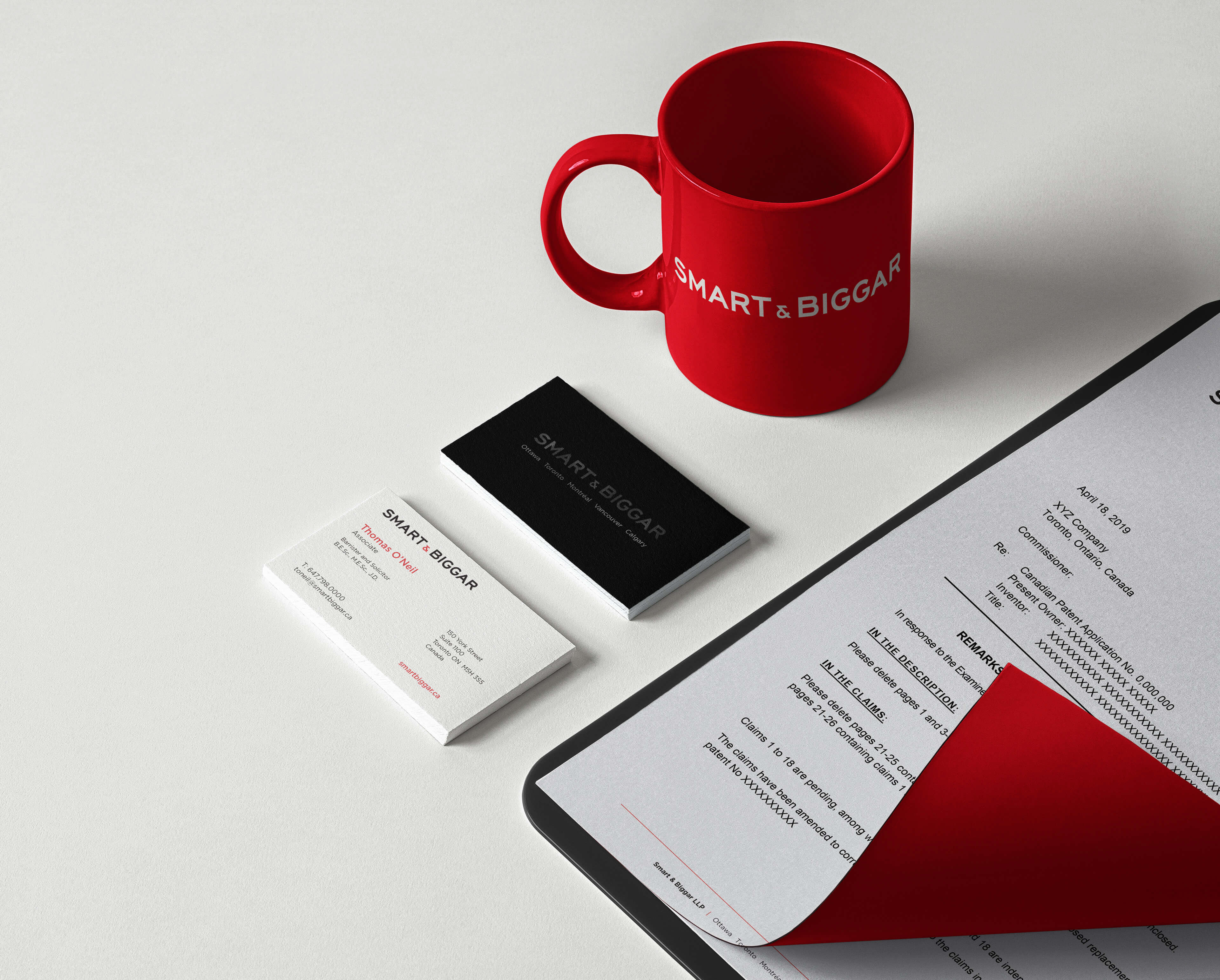
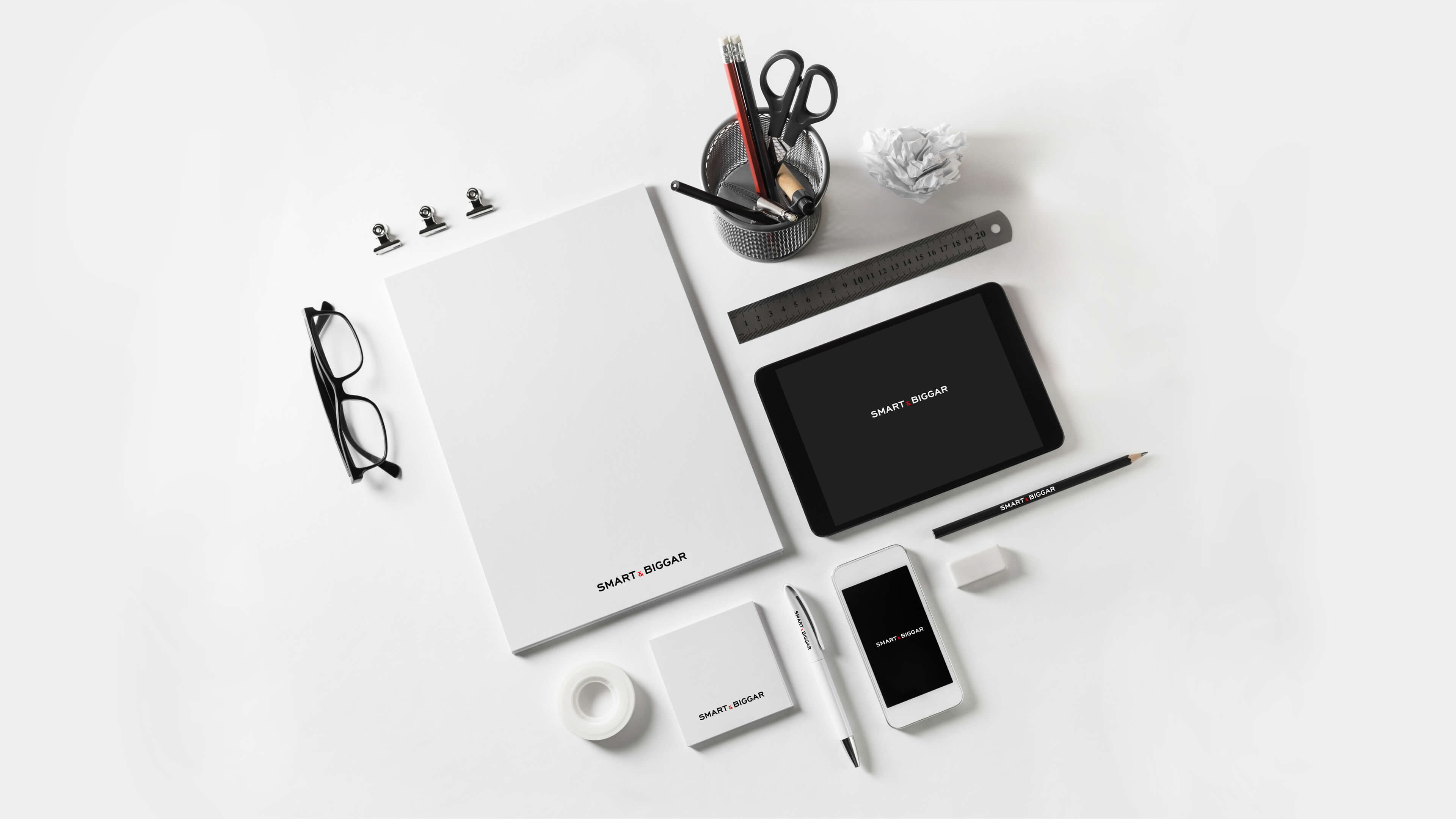
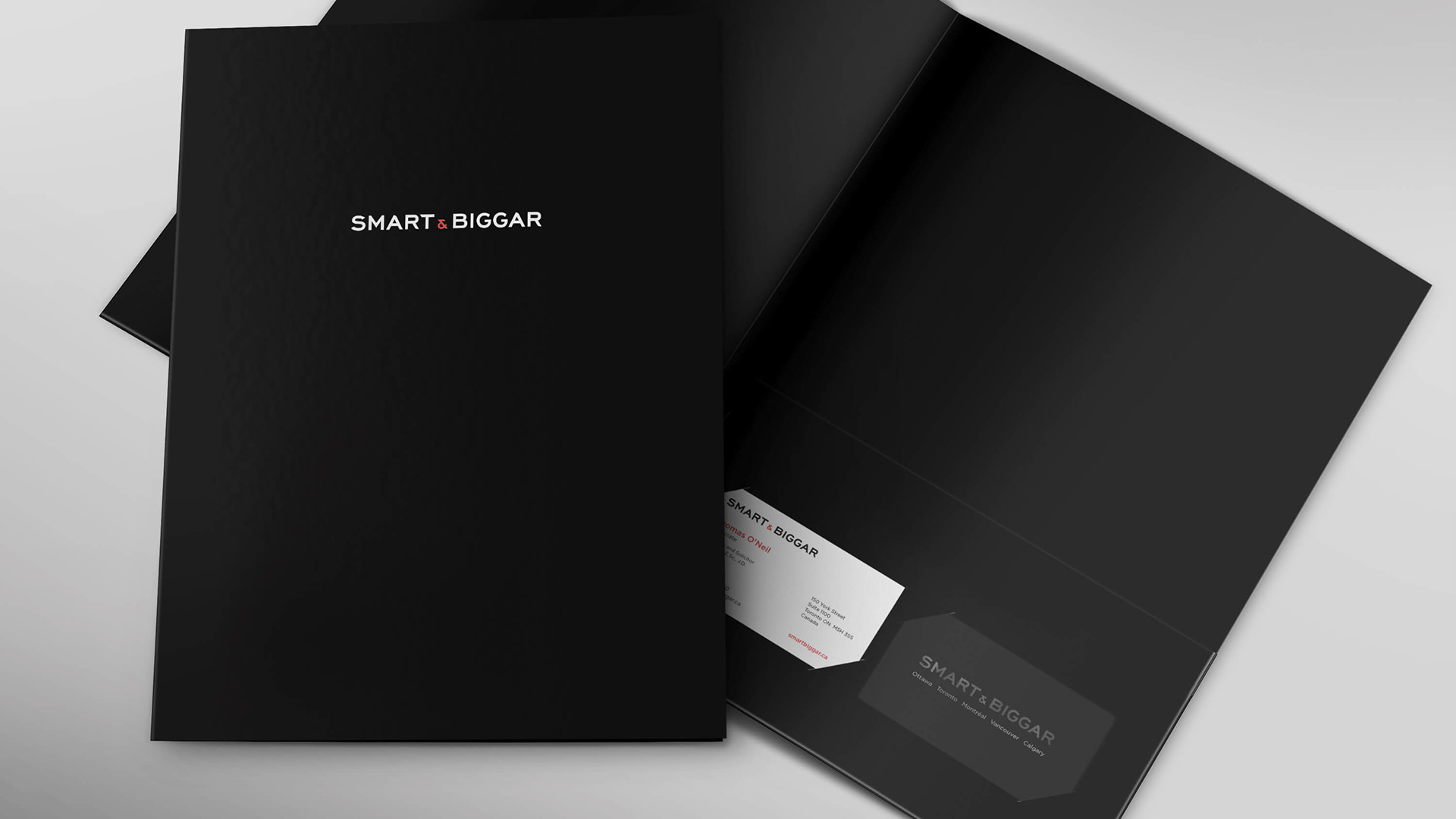
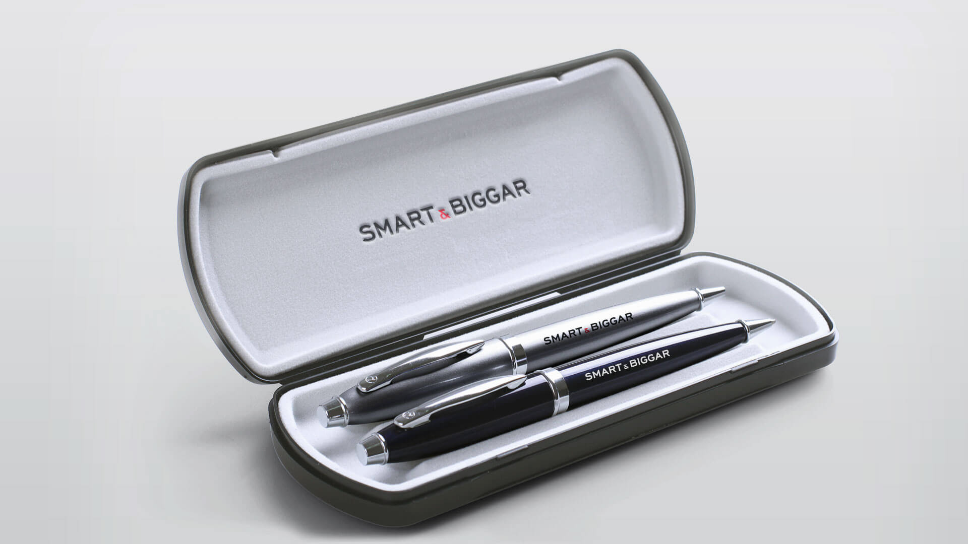
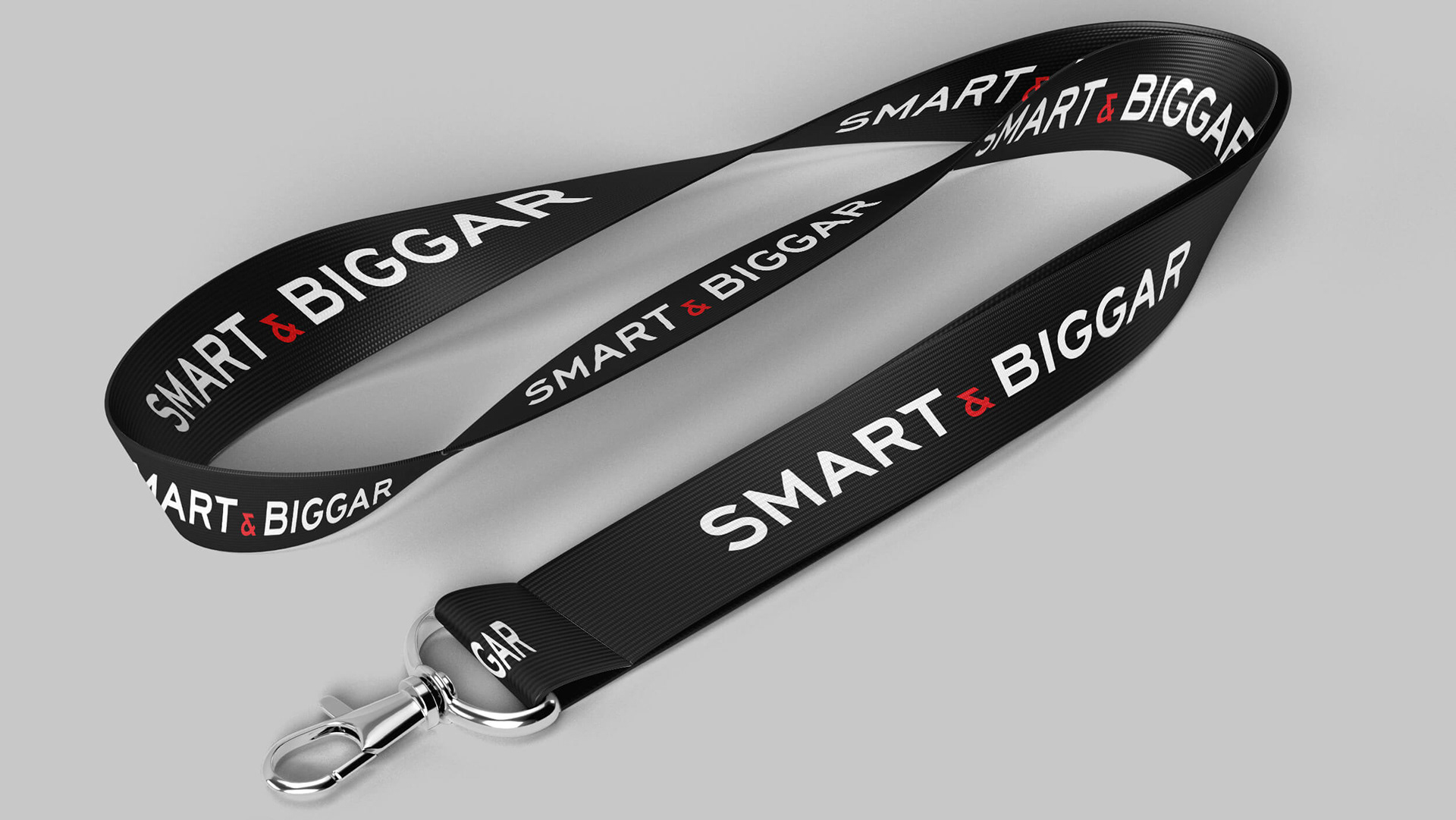
Cubicle Fugitive worked closely with the firm’s partners and marketers to refine and refresh their wordmark. Rather than reinvent the current wordmark completely, we chose to enhance existing letterforms to create a strong and recognizable logo. To give the wordmark a premium feel we increased the font-weight and customized several characters, overall contributing to the enhancement of their overall message. The original letter “S” was lacking in strength, and as a result, we modified its ends with two parallel angled cuts to give it a more prestigious and precise presence with a forward-looking personality. The angled cuts in "T" and "G" unite all letterforms in a balanced way. The customized "shark fin" curve on the apex of "A" and leg of "R" is what transforms it from stock typography to a feeling of distinguished professionalism. We tweaked the firm’s ampersand and provided the firm with various short and long-form brand extension options.