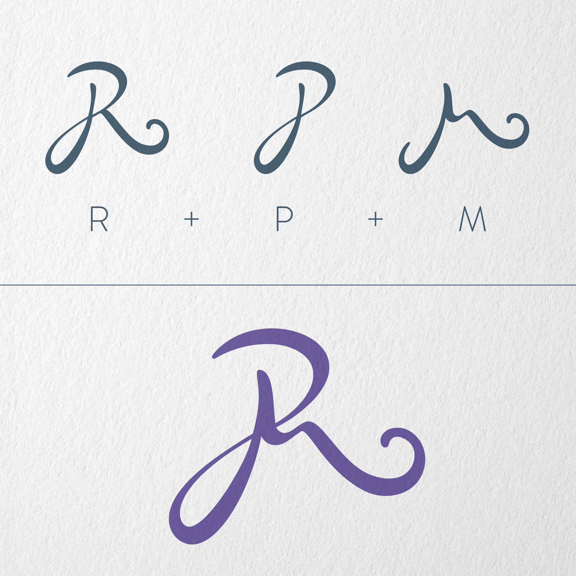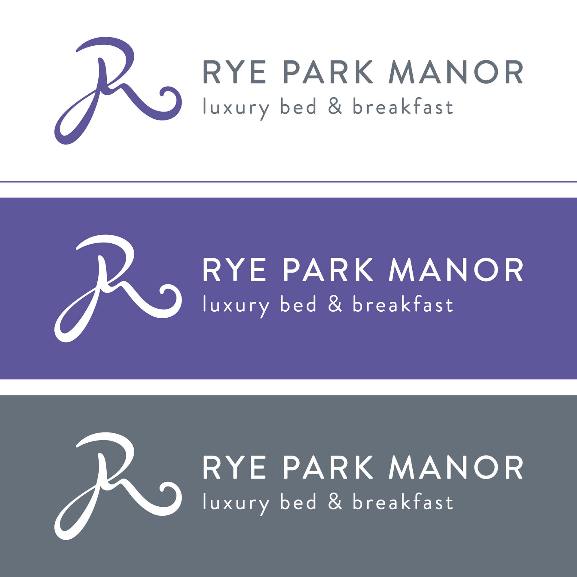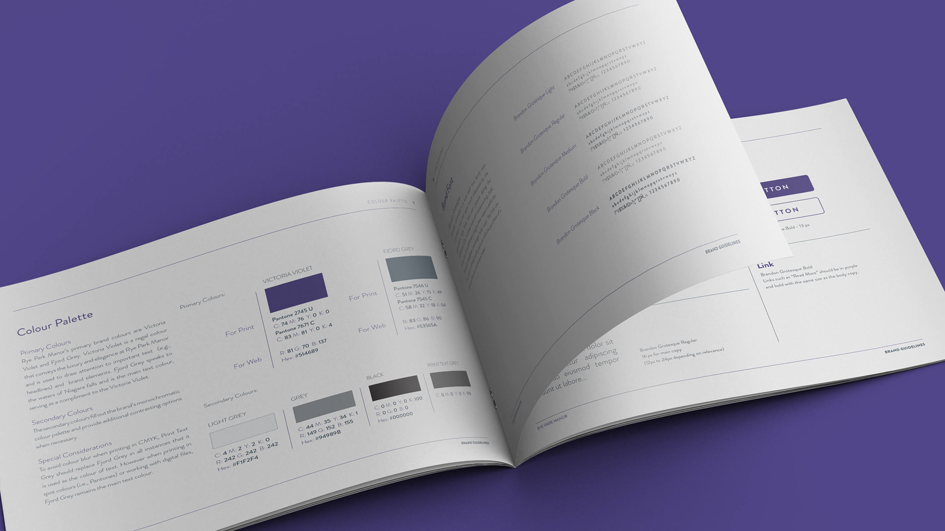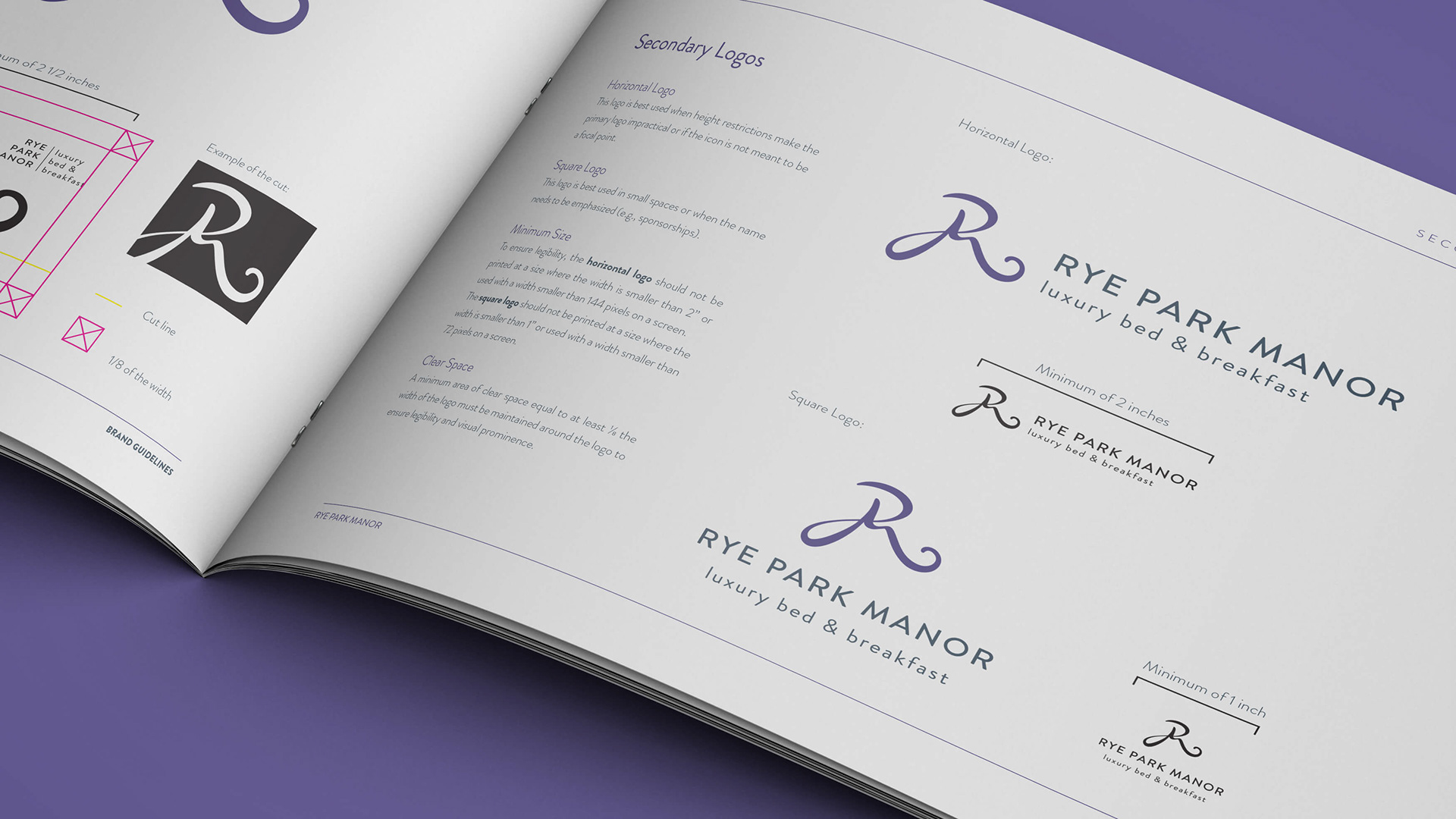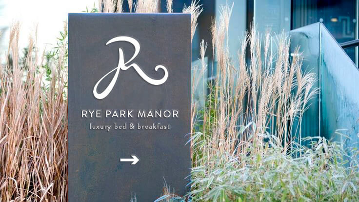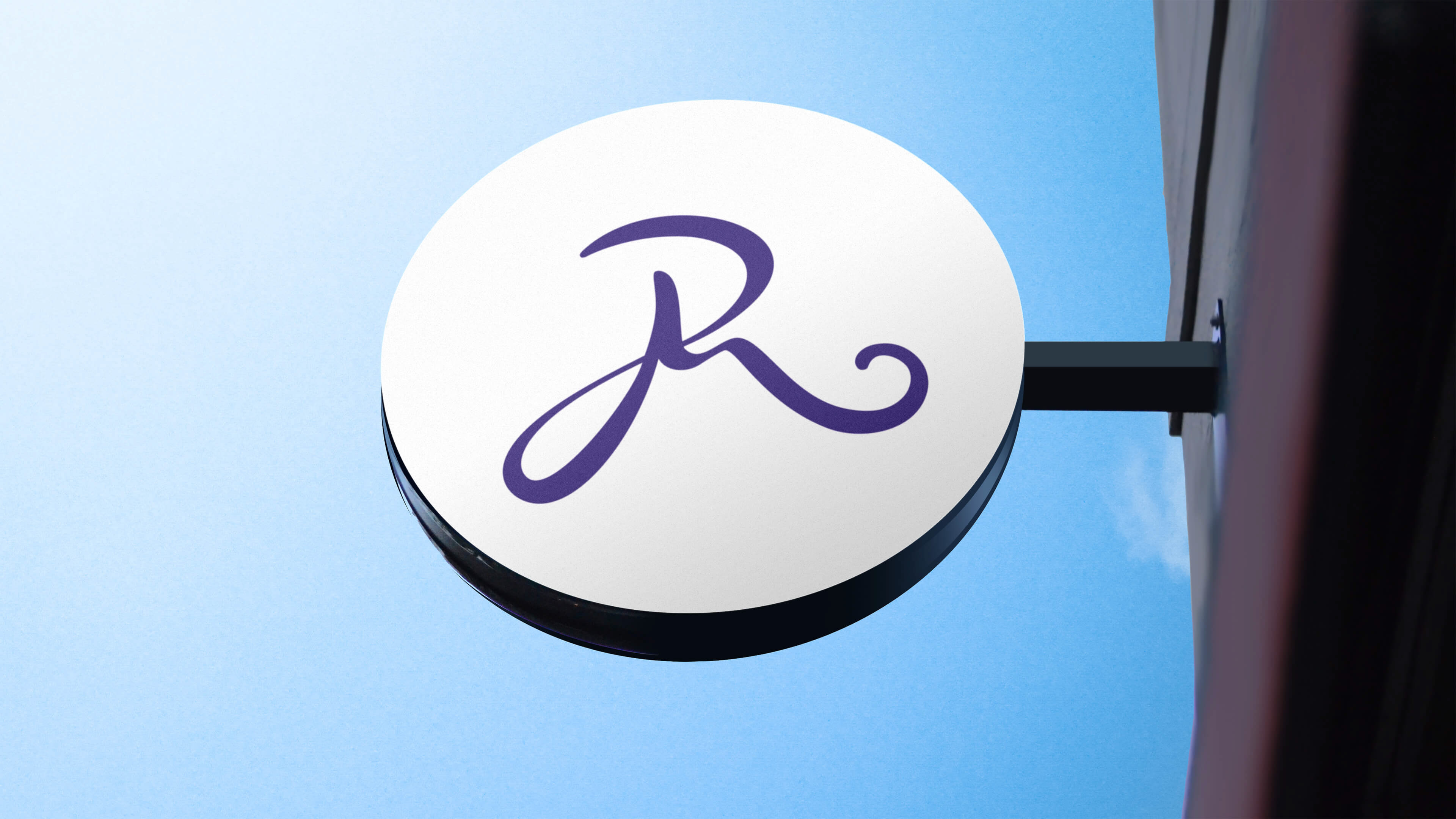


The Rye Park Manor brand, like the bed & breakfast, is sophisticated, unique, and premium. Working with the owners of the B&B, we created a logo and icon that is as unique as the property they have created. The icon combines Rye Park Manor’s initials into a single iconic character reminiscent of a royal monogram. Its sweeping curves represent the elegance that is offered to visitors. This leads to the ‘waves’ in the letter ‘M’ that are reminiscent of the Niagara Falls themselves. Finally, the icon is angled slightly upward to convey a feeling of power and optimism. Rye Park Manor’s primary brand colours are Victoria Violet and Fjord Grey. Victoria Violet is a regal colour that conveys the luxury and elegance at Rye Park Manor and is used to draw attention to important text (e.g., headlines) and brand elements. Fjord Grey speaks to the waters of Niagara Falls and is the main text colour, serving as a compliment to the Victoria Violet.
