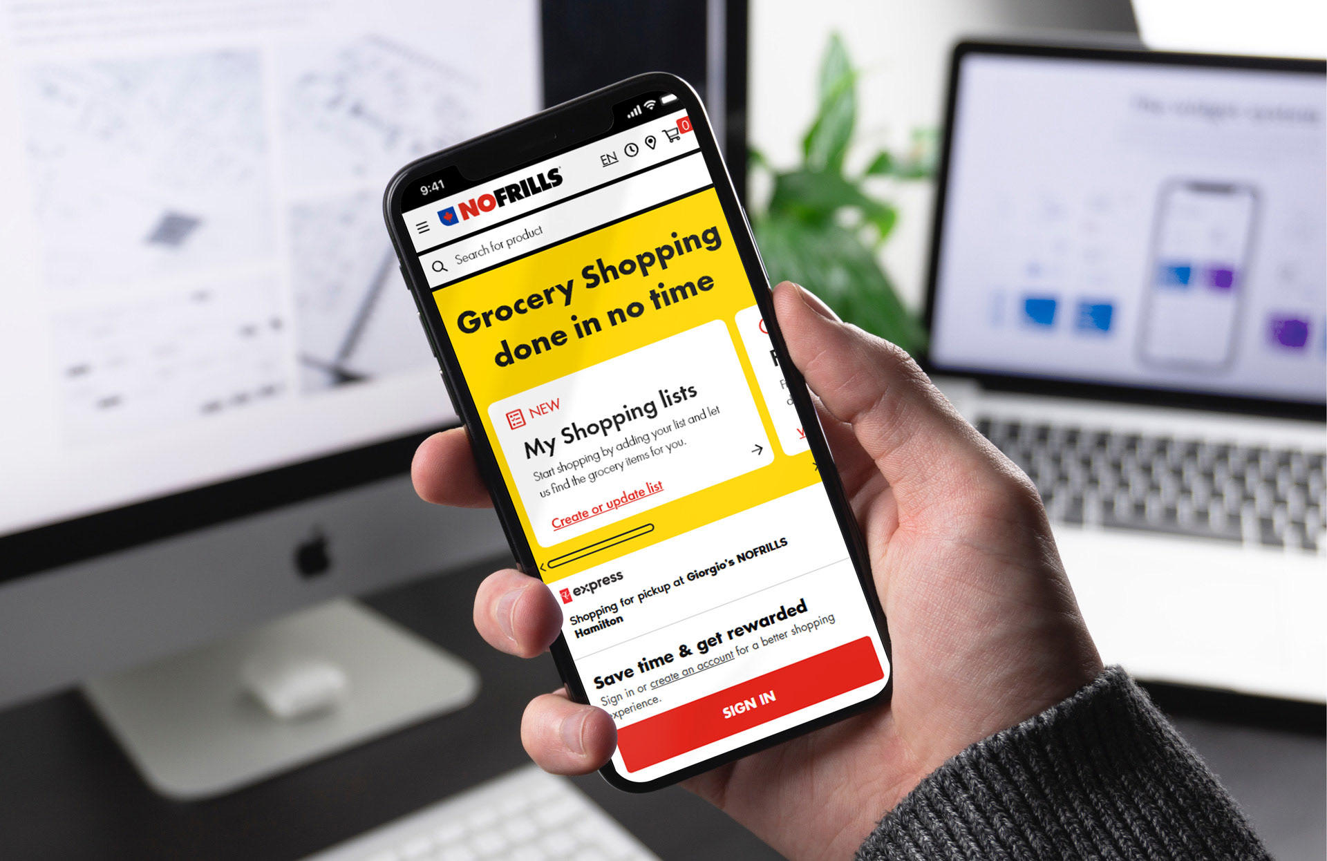
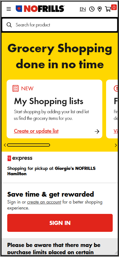
With "Shopping Lists" as a new feature
Role: UX Researcher and Designer
Course/College: UX Design from Juno College
Client Example: No Frills
Timeline: February 27, 2021 to April 17, 2021
Course/College: UX Design from Juno College
Client Example: No Frills
Timeline: February 27, 2021 to April 17, 2021
Intro
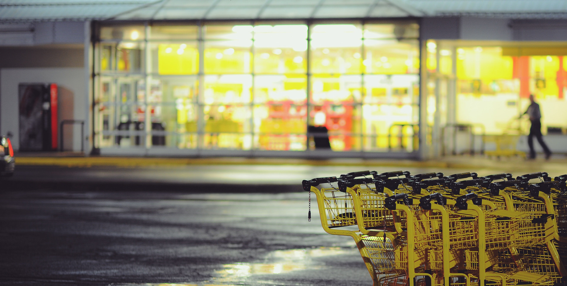
During my part time UX course at Juno college I was assigned with the project of redesigning a functional user experience flow of buying groceries online. I selected No Frills to be my imaginary client, a Canadian supermarket owned by Loblaws Companies Limited with over 200 franchise stores located in nine Canadian provinces.
The Challenge
With the hit of the Covid-19 pandemic most supermarkets had to quickly adapt to creating an online store but might not have had enough time to study their customers and create an experience that would meet their expectations. People do have a better reason to shop online now but while there was an increase in online shopping, in-store grocery shopping still exceeds by a significant margin. We need to understand the main reasons behind that to redesign a website that encourages people to shop online, and the online experience as effortless as possible, so they feel like repeating the process next time they need groceries.
Approach
User Interviews, Card Sorting, User Persona, Empathy Map, Affinity Mapping, Site Map, Content and Accessibility Audit, Wireframes, Low Fidelity Prototype, Usability Testing, Style Guide, High Fidelity Prototype.
Tools
Miro, Google Sheets, GlooMaps, Zoom, Microsoft Word, Sticky Notes, Pen and Paper, Adobe Indesign and Adobe Xd.
Solution
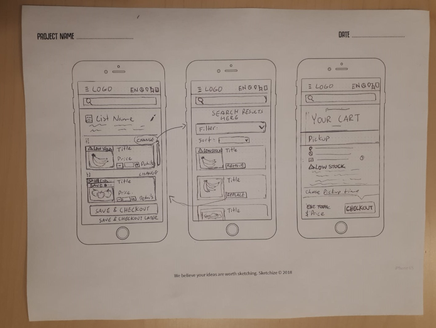
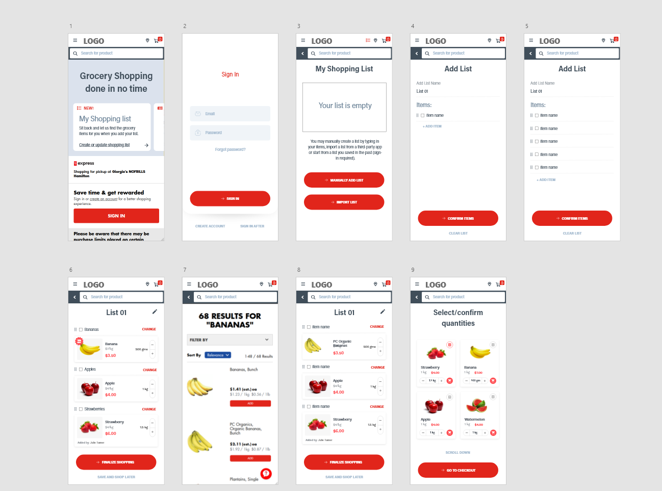
"My Shopping Lists": A new feature created to allow users to start their grocery shopping by adding their list of items first. The website will source the products for them, and then allow users to select quantities and change products. Finally, they can choose to add to the cart and finish the purchase, or save the shopping list for future grocery shopping.
Research & Analysis
In the project's initial phase, my primary focus was to gain a profound insight into the values, needs, desires, and challenges of No Frills' customers through a series of interviews and research activities. In parallel, a comprehensive website analysis was conducted, however, rather than making assumptions about what should be redesigned, I placed greater importance on customer feedback to guide the planning and execution of the mobile user experience flow to truly reflect their preferences and meet their expectations.
Key Questions:
• How do people plan their shopping?
• What do people like/dislike about online shopping?
• How can it be improved and what is missing?
Methodology:
To gather the intended information, I used the following methods:
• User Research (4 interviews – via video call due to the pandemic)
• Usability Testing (3 tests – of the current website)
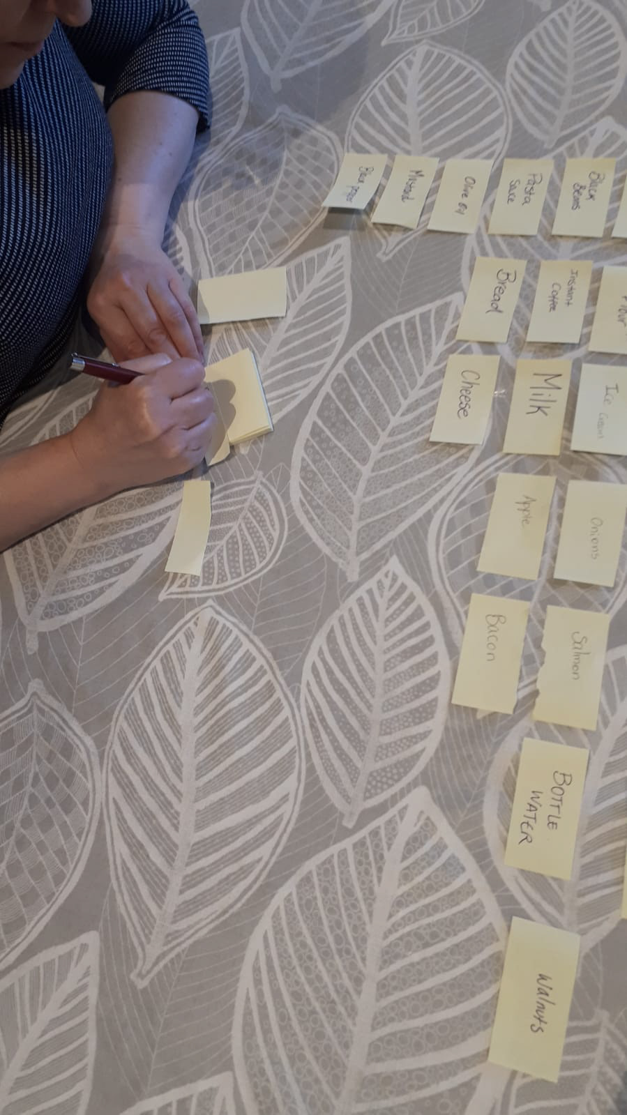
• Card Sorting (3 activities – to understand users thinking of organizing items)
• Site map and Content Audit of the current site
• User Research (4 interviews – via video call due to the pandemic)
• Usability Testing (3 tests – of the current website)
• Card Sorting (3 activities – to understand users thinking of organizing items)
• Site map and Content Audit of the current site
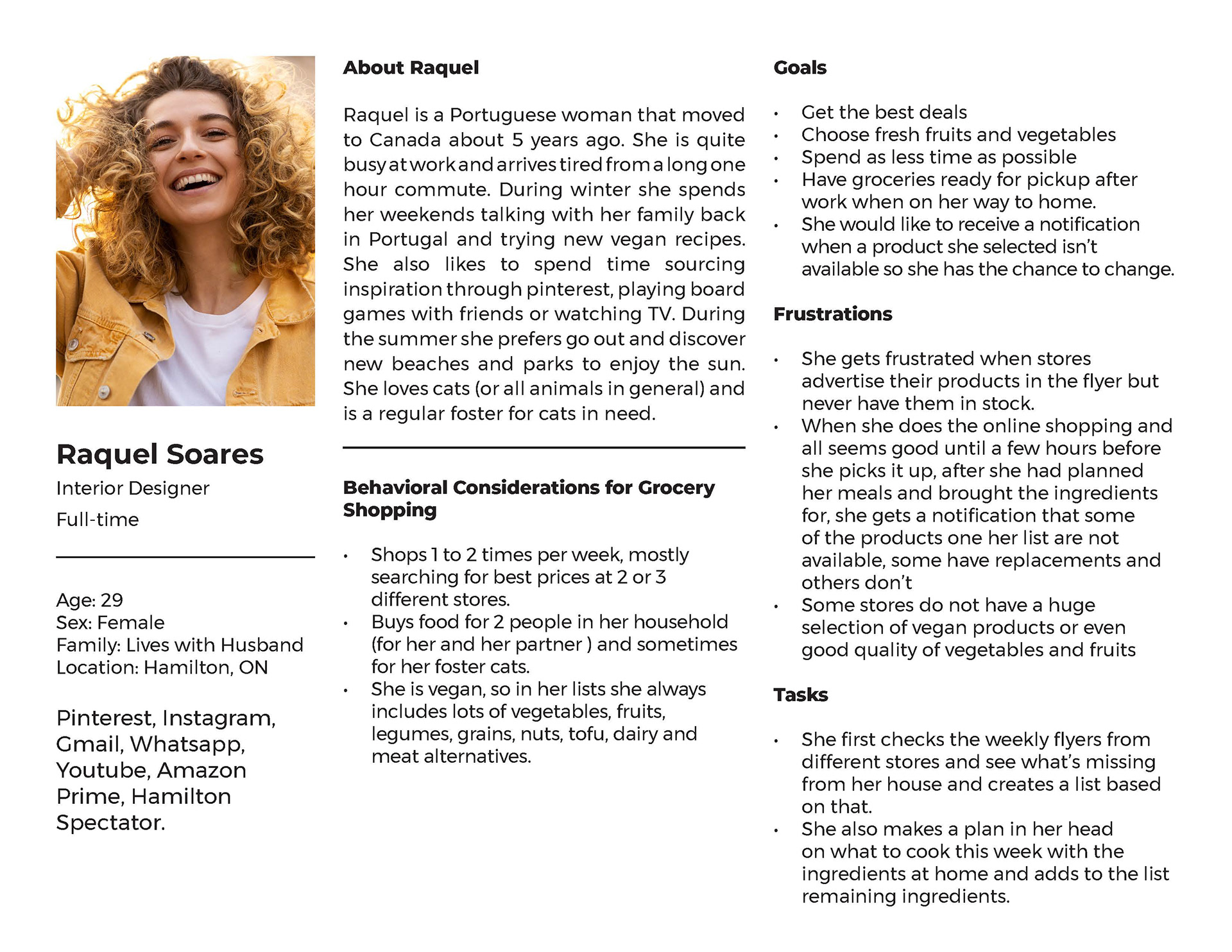
• User personas (making it easier to design with specific users in mind)
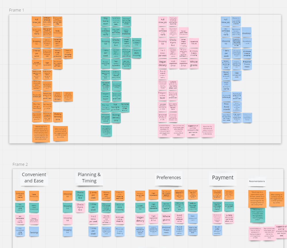
• Empathy mapping (a structured way to understand and address users' thoughts, feelings, and behaviors)
• Affinity mapping (to help organize and prioritize insights and ideas gathered from users, streamlining the design process by identifying common themes and pain points)
• Empathy mapping (a structured way to understand and address users' thoughts, feelings, and behaviors)
• Affinity mapping (to help organize and prioritize insights and ideas gathered from users, streamlining the design process by identifying common themes and pain points)

Research & Analysis Conclusion
Upon creating the empathy and affinity maps where I was able to see the patterns between each persona, the insights started to become clearer. The following insights were the foundation for the redesign of the user flow from sourcing to purchasing:
Positive Reinforcements
Convenience and ease
• They all agree that doing it from the comfort of their home, where they can avoid crowds and long lines in the cashier, is quite convenient.
• Not having to carry things around.
• Source through a diverse inventory and easily compare online
• Add and remove items easily from the cart
• All interviewers are more than capable using the Internet.
• They are familiar with online shopping and have done so in the past with their own devices
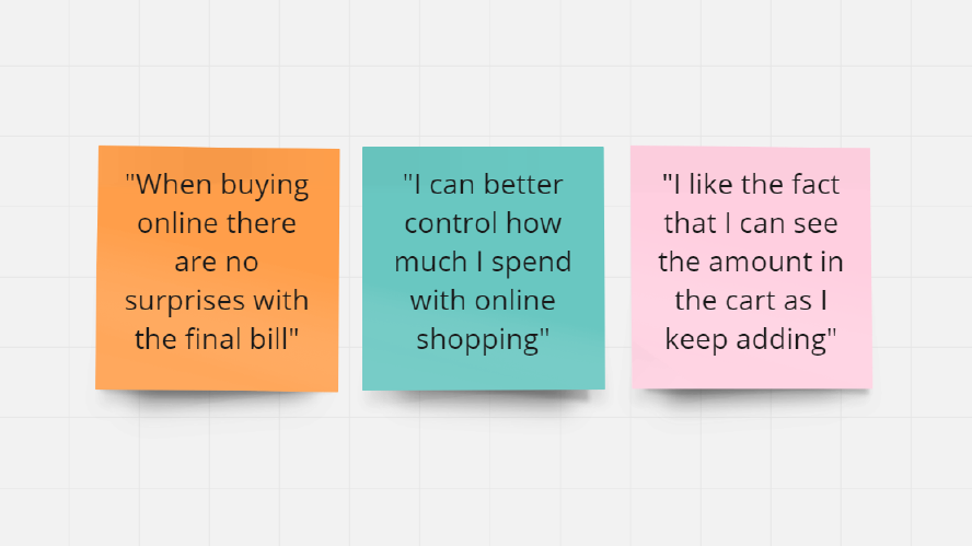
Better Control of their expenses
• All the interviewers said that when shopping online they have a better control of their expenses because the amount in the cart is visible and always updated.
Quick
• Everyone was surprised that it did not take longer than it would if they were shopping in person
• They all agree that doing it from the comfort of their home, where they can avoid crowds and long lines in the cashier, is quite convenient.
• Not having to carry things around.
• Source through a diverse inventory and easily compare online
• Add and remove items easily from the cart
• All interviewers are more than capable using the Internet.
• They are familiar with online shopping and have done so in the past with their own devices
Better Control of their expenses
• All the interviewers said that when shopping online they have a better control of their expenses because the amount in the cart is visible and always updated.
Quick
• Everyone was surprised that it did not take longer than it would if they were shopping in person
Negative Deterrence
Not having control
• Some concerns about giving away information online
• Not being able to look at products in person, for example to check sizes or expiry dates
• Worries about delayed pickup/delivery time when they need groceries sooner
• Not having control over which products to select, for example fresh fruits and vegetables and choose between ripe and unripe
Unpersonable
• Not having someone to talk like you would in store if you were looking for something
Key Findings
While certain feedback lies within the company's domain, as a UX designer committed to optimizing the online shopping experience, the following key findings have been instrumental in shaping my approach:
• Most customers start planning their grocery shopping by creating a list
• Most customers start planning their grocery shopping by creating a list
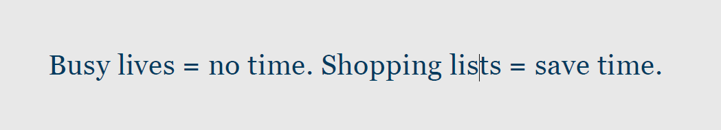
• They live busy lives and appreciate convenience and ease
• They want to maintain control over their purchases
• They feel that online shopping is unpersonable
• They would like to save orders to easily reorder on a weekly basis and avoid repeated planning.
Solution
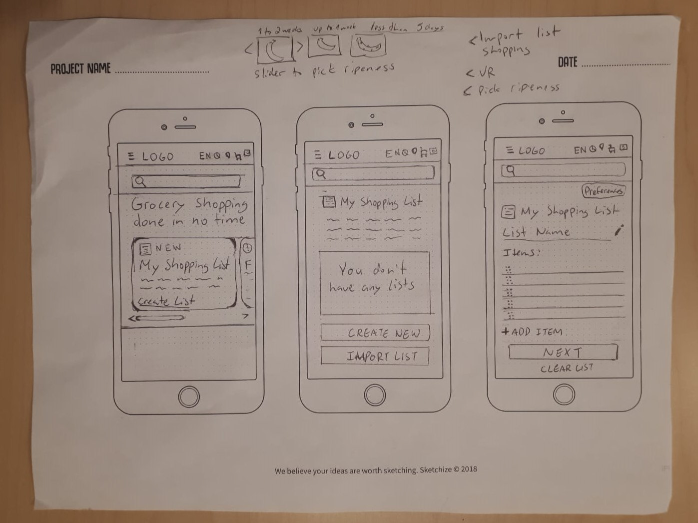
For individuals leading busy lives, the task of grocery shopping often poses a significant time-consuming challenge. A recurring observation among this demographic was their reliance on paper lists to streamline their shopping routines. To enhance the convenience and efficiency of the online shopping experience, I initiated the development of a new feature called "My Shopping Lists."
The "My Shopping Lists" feature empowers users to seamlessly create, save, and update shopping lists. Once a list is generated, the website would intelligently source the specified items, thereby simplifying the process for customers, who would then only need to confirm quantities and item choices.
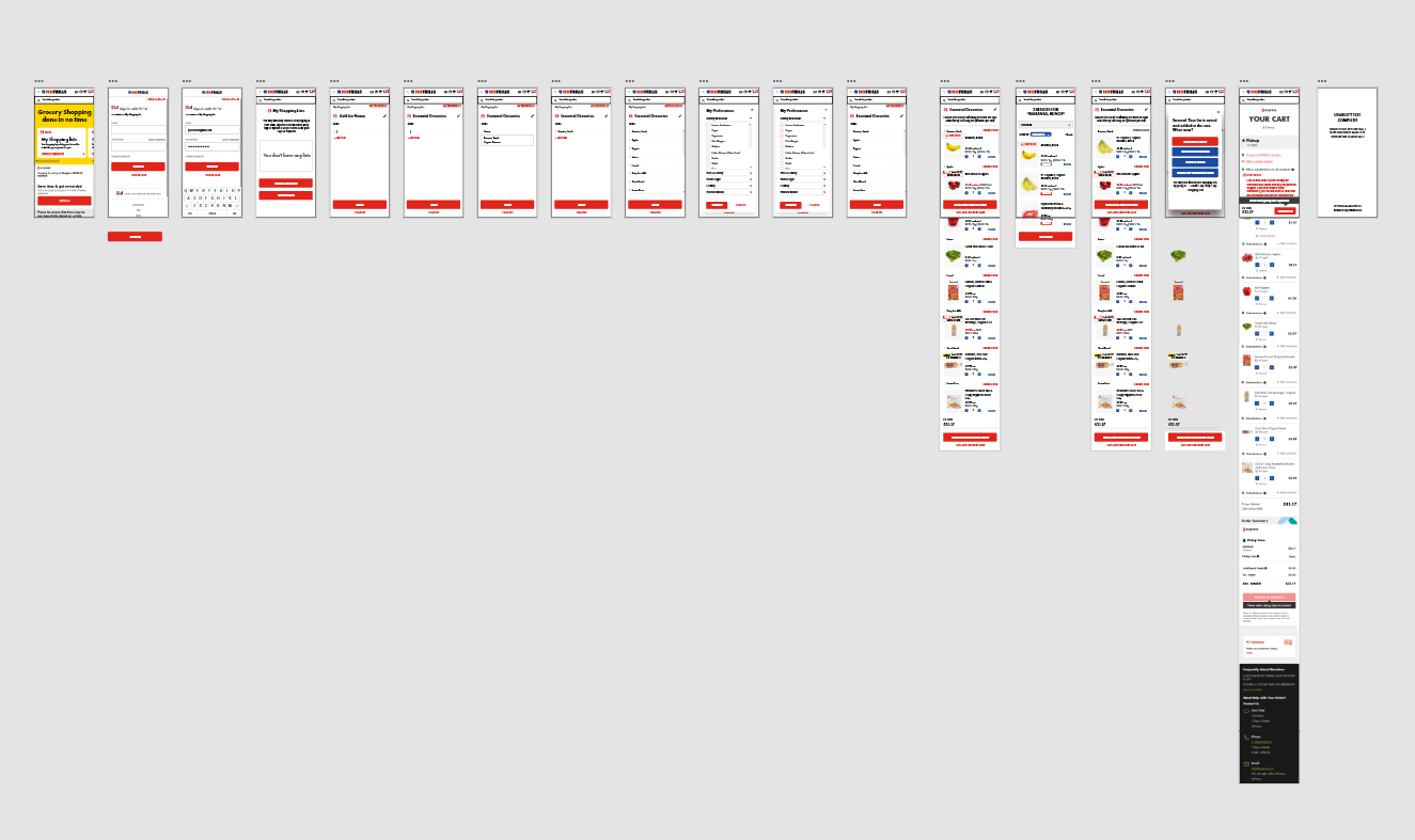
Wireframes, Low Fidelity Prototype & Usability Tests
Usability Testing of first prototype (4 users)
In this task, I actively gathered user feedback, noted their challenges, and asked clarifying questions. This hands-on approach allowed me to directly identify issues and gather valuable suggestions.
Key Positive Findings:
• Users frequently start their grocery planning by making lists, showing strong interest in the new feature.
• Three users who were initially hesitant to sign in right away appreciated the "sign in later" option.
• Users found adding items to the list to be straightforward.
• They had no trouble locating where to change an item.
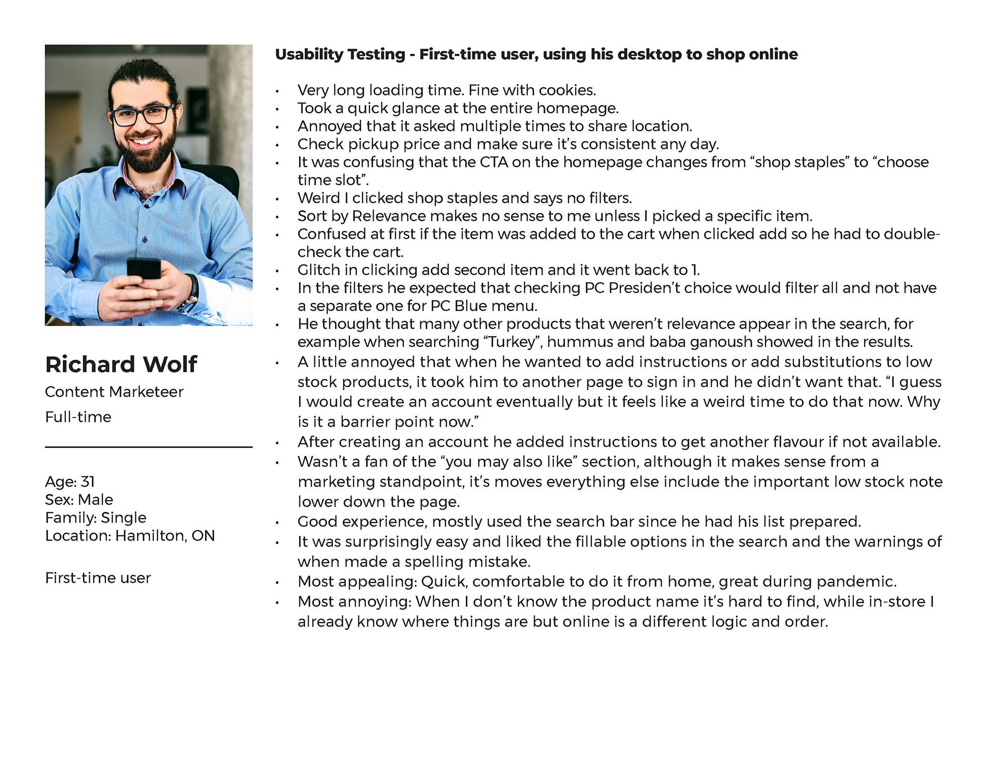
Key Negative Findings:
• One user expected to use the main search bar to add items to the list.
• Another user had concerns about how the feature handles typos and non-English speakers.
• A user was confused by the automated item suggestions in the "confirm items" section.
• Another user found it a bit confusing to differentiate between replacing and adding items because the button still said "add."
• Some users wished to select quantities when changing or confirming items to reduce steps.
• Users were sometimes perplexed when items were added to the cart, suggesting a need for clearer messaging.
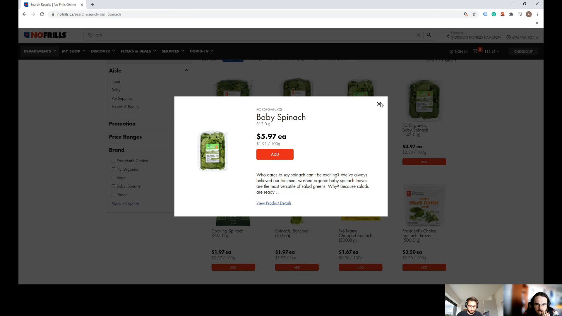
Edits + High Fidelity Prototype
Upon conducting usability tests, I made the following adjustments before arriving to the final prototype:
Project focused solutions:
1. Added auto-suggest capability for when adding items to the list
2. Added a "My Preferences" button so it makes more sense to generate the items based on the customers' overall preferences
3. Added the option to add the number of items and to add to the cart earlier in the process
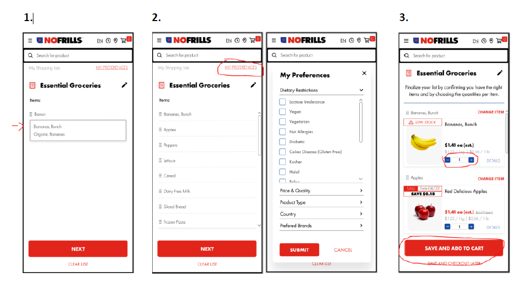
4. Written new copy to help guide the user on each step and changed the wording of certain buttons to be clearer.
5. To make it more personable and approachable, I added fun “easter eggs” for the hover state of buttons such as when you hover on “Add to cart” it will show “My belly can’t wait”. The idea is to open a discussion about other fun copywriting possibilities, such as including a fun phrase for when a page is loading.
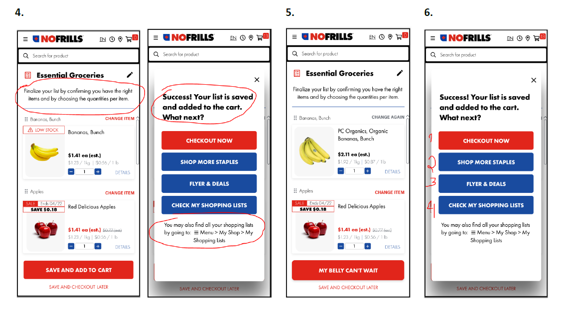
6. When the user clicks “save and add to cart” they now have more than one following possibility. A pop-up will appear with a success message followed by 4 buttons: “checkout now”, “shop more staples”, “flyer & deals”, and “check my shopping lists”.
Additional improvements:
• Added an icon at the top to change the language of the website
• Added a clock icon at the top to quickly check the next available pickup time
• Added a details button so the user can learn more about each product
• Improved how information is organized for details such as “LOW STOCK” and “SALE”
• Added a clock icon at the top to quickly check the next available pickup time
• Added a details button so the user can learn more about each product
• Improved how information is organized for details such as “LOW STOCK” and “SALE”
Conclusion
I really enjoyed going through the entire UX design process during this course project at Juno College. This course made me realize how vital usability testing is, given that everyone has their unique way of processing and finding information. It helped me uncover issues I hadn't considered before, allowing me to fine-tune my approach and come up with solutions before diving into the nitty-gritty of UI design.
The trickiest part of this project was finding the right folks to interview – those who regularly shop online and can give valuable feedback. It was also challenging to focus on one problem at a time and express my findings concisely in a problem statement.
I learned that, even though online shopping is more convenient now, many people still favor in-store shopping. This preference is anchored in certain concerns without readily available solutions, such as trust issues of others picking out their groceries. Perhaps, the prospect of comprehensive automation in supermarkets, although futuristic, represents a potential turning point. But, despite these challenges, the allure of saving time still catches people's interest.
I hope that my solution can be a key motivator for customers to embrace online shopping, offering them the convenience of saving time and the freedom to focus on more meaningful activities.
Test the prototype by clicking the link below:
https://xd.adobe.com/view/20f5a5ce-9952-40f9-9382-893302dd2d95-75a6/
https://xd.adobe.com/view/20f5a5ce-9952-40f9-9382-893302dd2d95-75a6/
...
Thank you for exploring this UX journey with me.
If you're on a quest for exceptional user experiences, let's collaborate to create something extraordinary. Reach out, and let's embark on a design adventure together.