Overview
Author's Republic, a large audiobook distributor, initially reached out to me to redesign their backend interface that is used by their customers (authors and narrators). They had no intention to redesign their logo but once they saw their original logo compared with the new web designs they instantly realized it was time to change the logo as well.
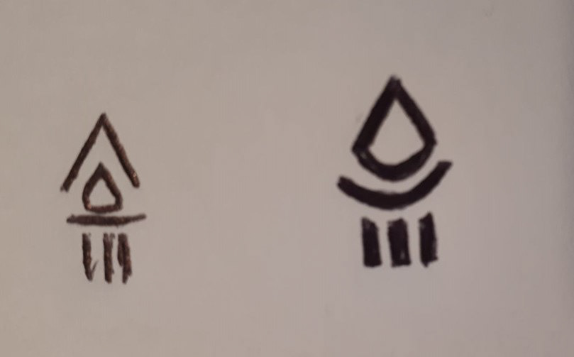
The firm was proud of their original logo and during the interviews and research I realized the torch/flames and roman column was quite meaningful to them and although they were open to completely new designs at this point, they were more inclined in keeping those symbols.

Previous Logo
The Challenge
Unfortunately torches and roman columns are symbols that are overly used throughout the world of logos so the challenge was keeping the original meaning behind them but conveying them in a more unique and abstract way. That's when the conversation between literal and conceptual begin with the firm. I believe logos tend to work best when they conceptualize an idea rather than literally depict it. I had to convince them on the notion that logos can convey the same ideas and feelings but with a little mystery. Once I shared the symbolism and keywords that helped me create the logo concepts, the client had a better understanding of what I was proposing.
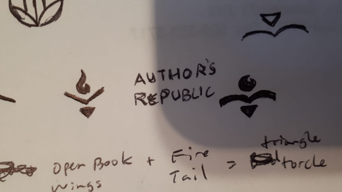
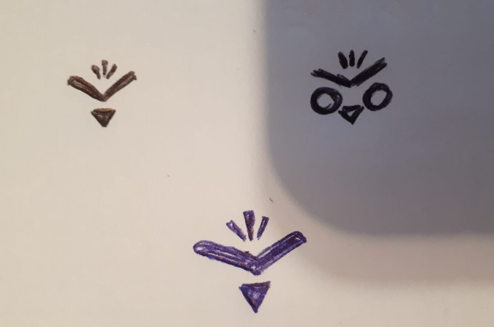
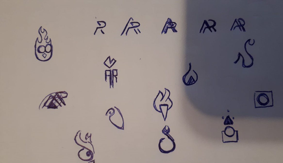
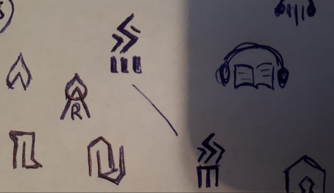
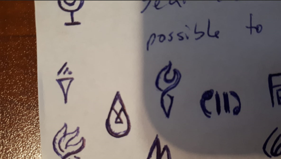
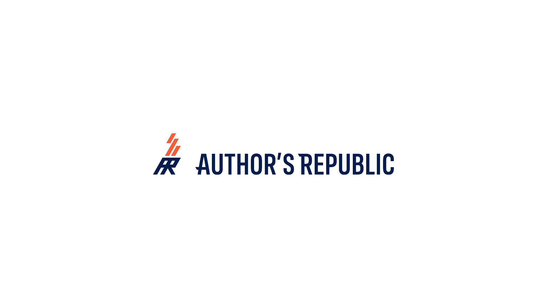
Initial Sketches and Logo Designs
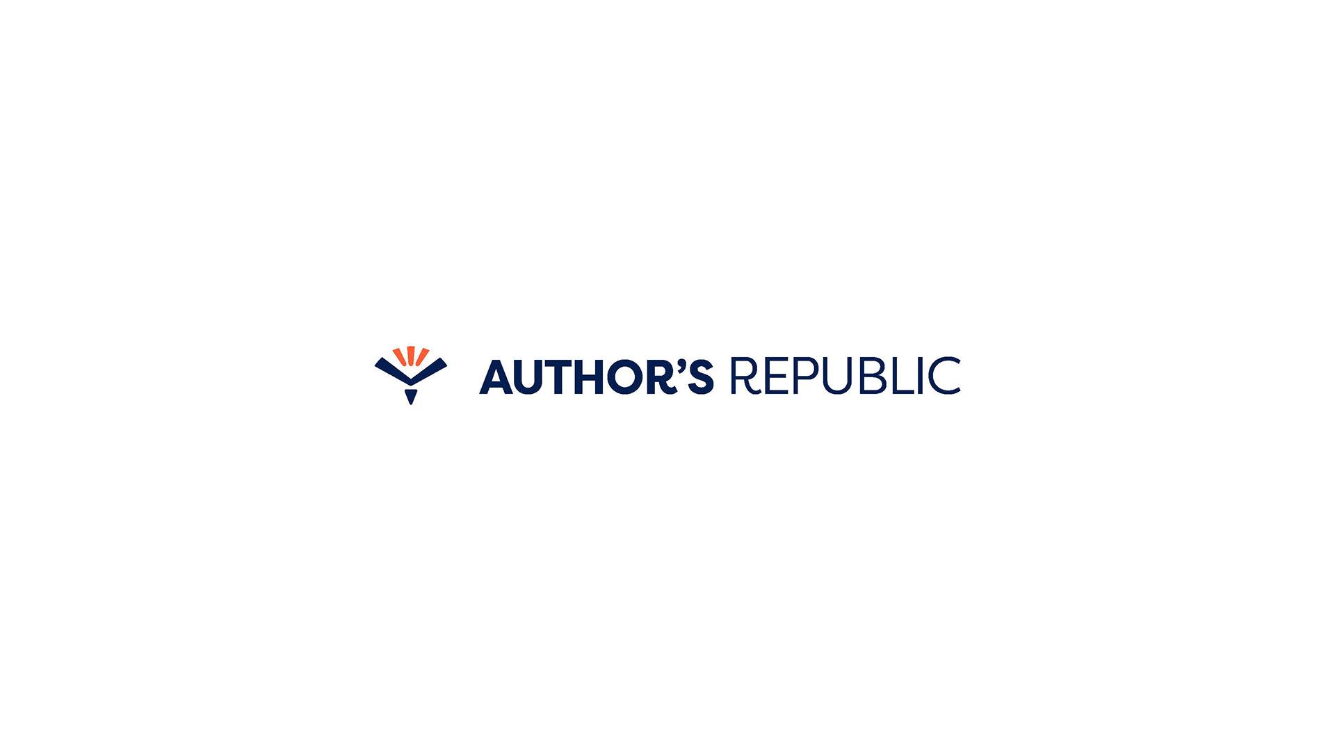
The Final Concept
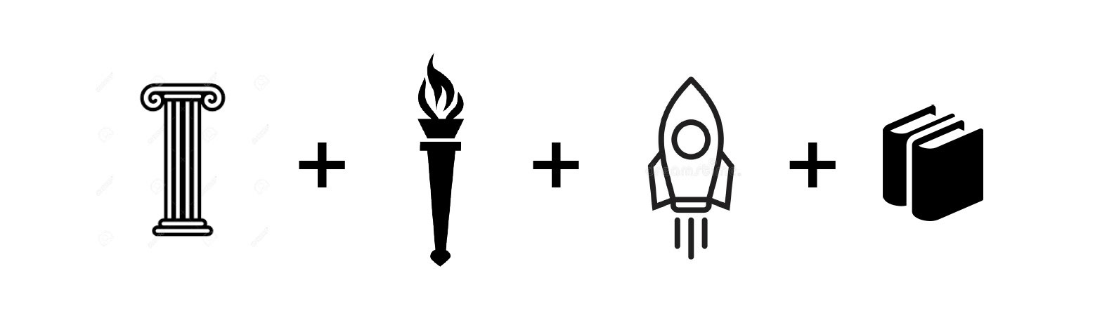
The icon concept was inspired by 4 main symbols that represent the brand.
1) The roman column, maintaining the heritage of their original logo that was inspired by the roman republic and roman authors.
2) The torch, representing the freedom and justice for authors that my client provides. Author's can choose any platform to publish and get more profit over what other distributors offer.
3) The Rocket, representing their quick response and ability to publish.
4) Books, representing the stories that authors have to share.
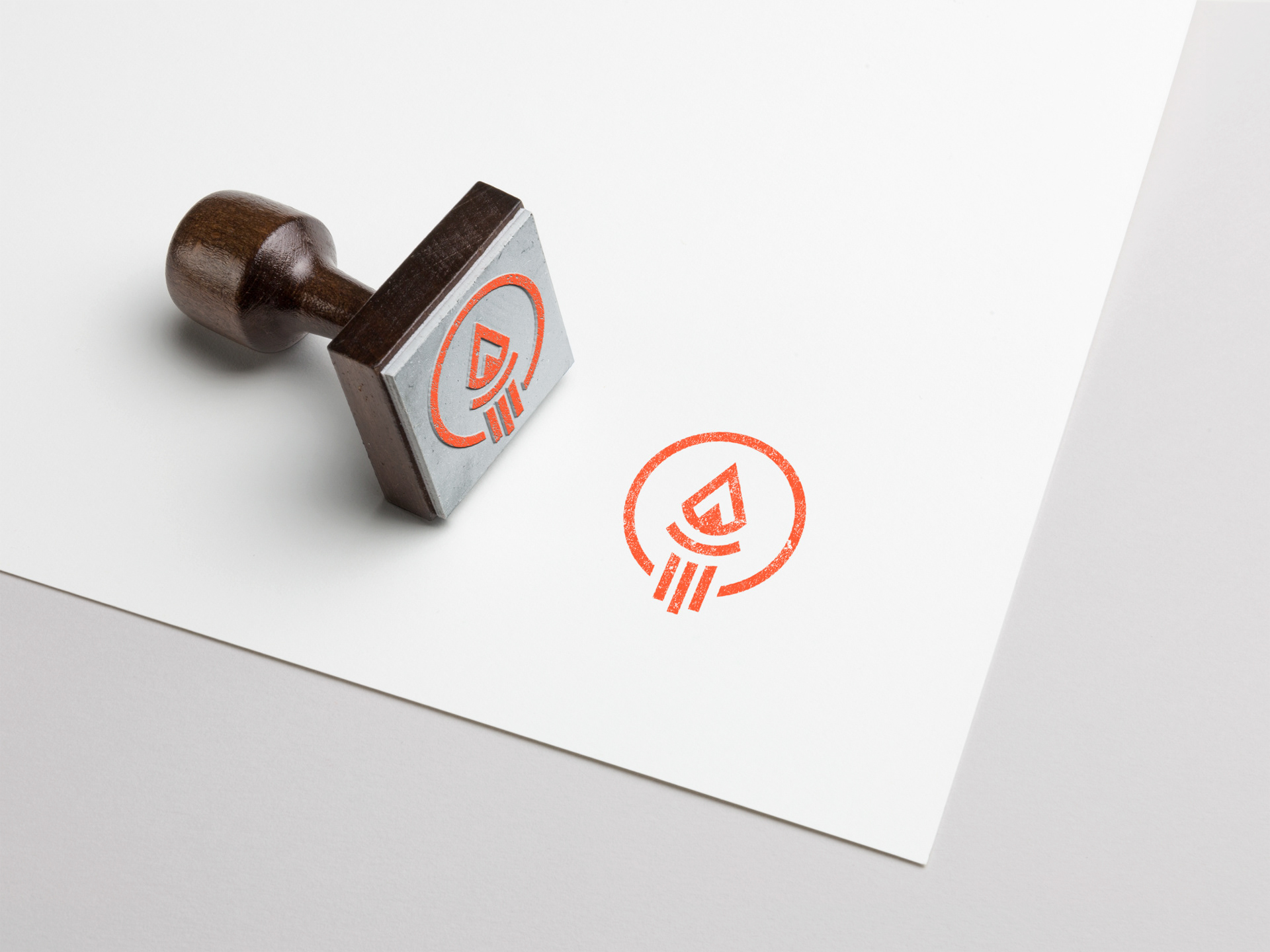
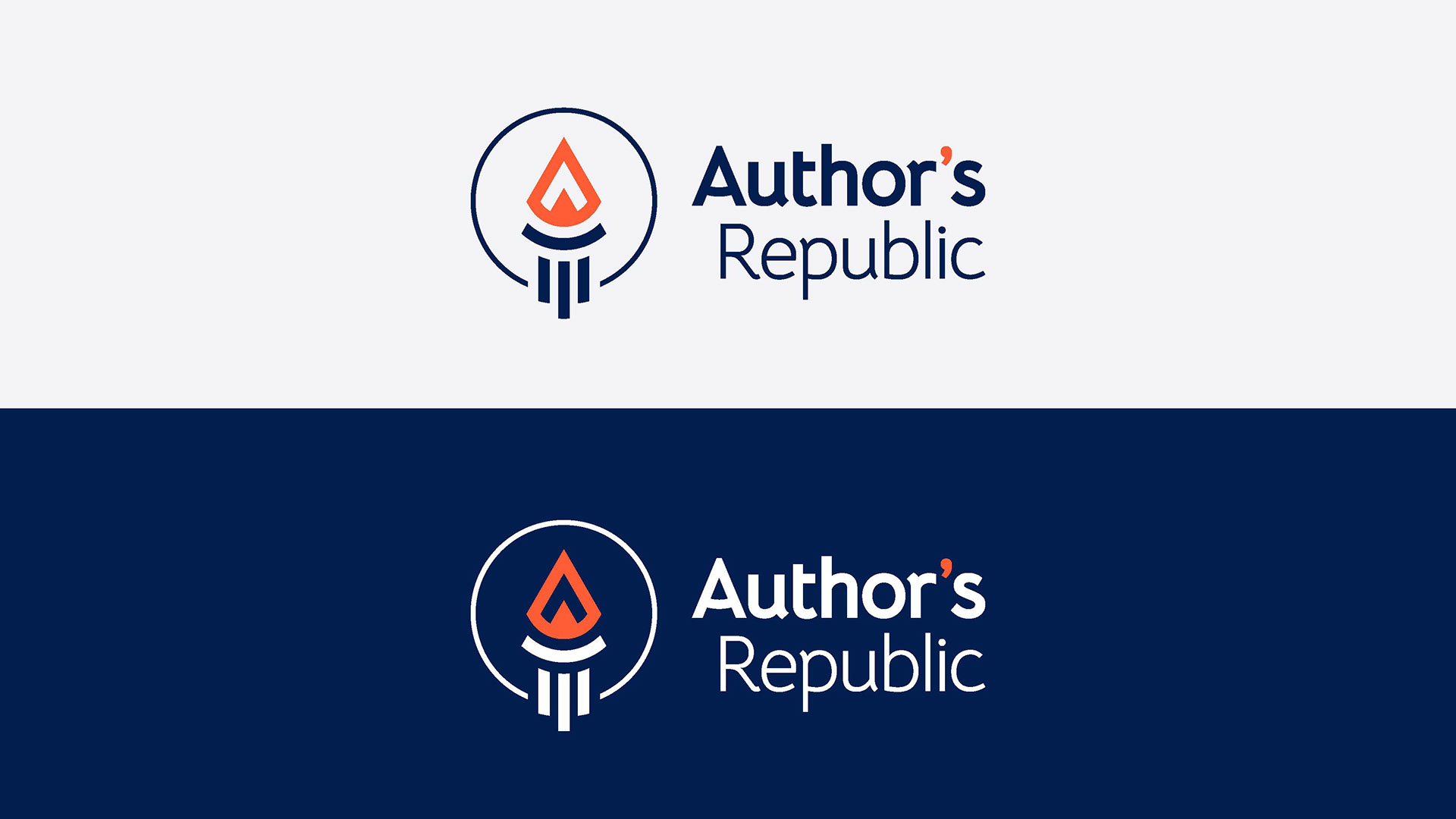
The Final Logo
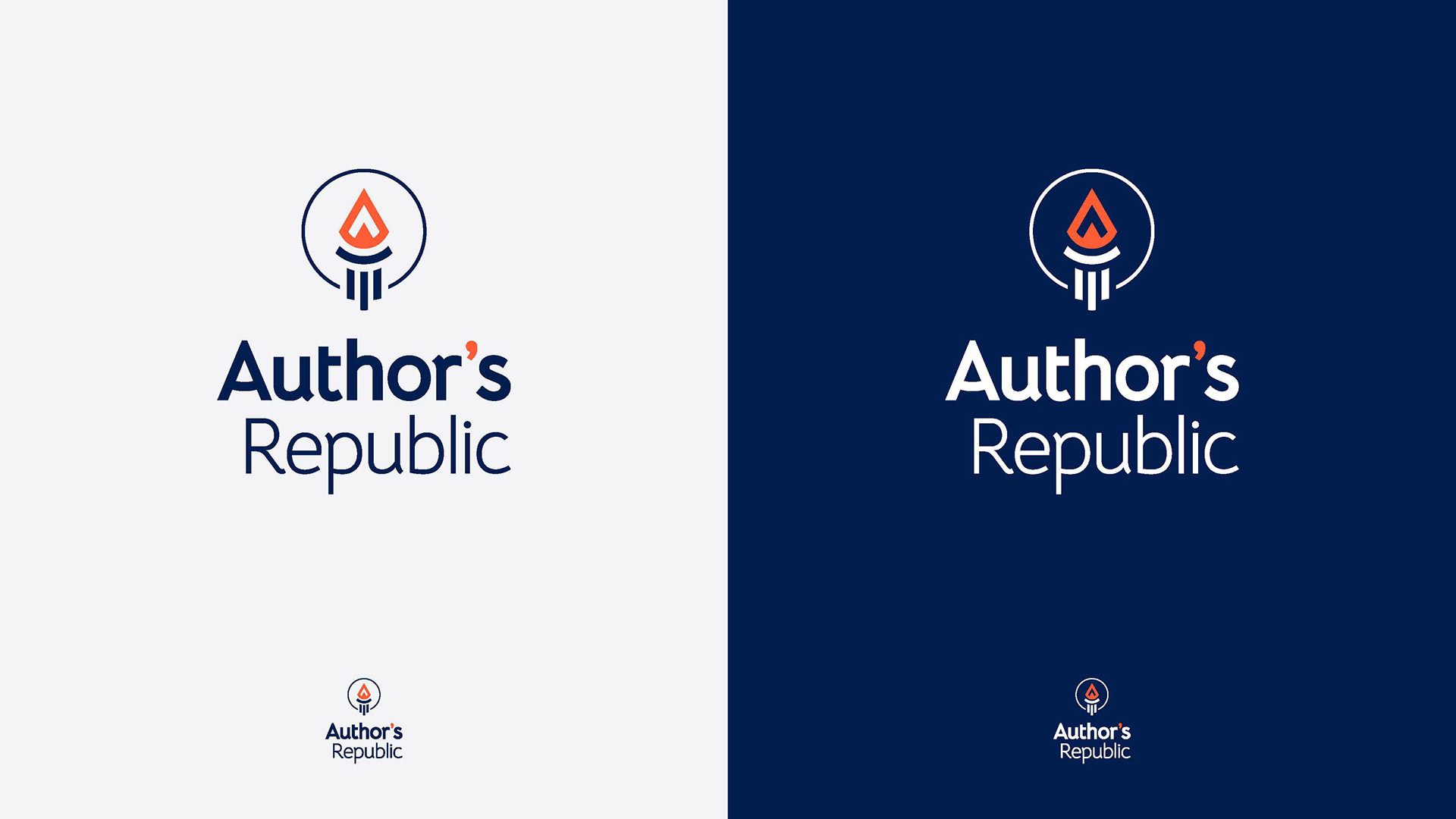
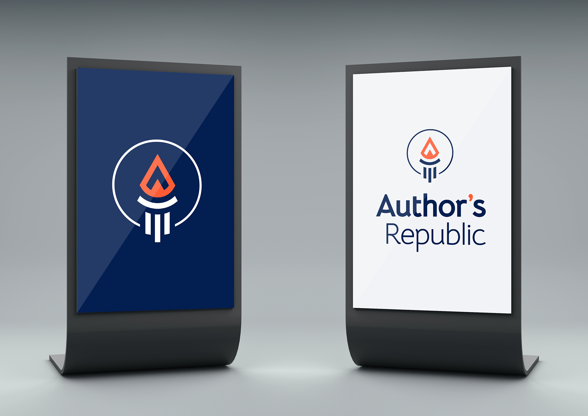
Mockups: To visualize the logo in action